HKU Med
2022 May - Sep
Help a Professor of Cancer to develop informative web & app
Design a website and mobile introducing cancer and give support to patient's family and friends.

Overview
We are always supportive
SUPPORT+ is an HKU-developed platform providing advanced cancer patients and their families with educational resources, palliative care guidance, and home-care support tools to help them navigate life-limiting illnesses positively.
Our Goal
Create a sweet and warm platforms for advanced cancer patients and their families
Problem
Tight deadline of cross-platform development
The SUPPORT+ website project faced significant hurdles, including an exceptionally tight half-month deadline for a fully responsive design, a lack of initial referencing direction from the client, and the pressure of simultaneously developing the companion mobile app.
So we divided our responsible part and I focused in Website part first then mobile app. As the client didn't have design direction on the look and feel, I drafted a one-page design:

As it's a semi-formal website, I made one more business- related style UI design with separating pages.

As it's a semi-formal website, I made one more business- related style UI design with separating pages.
Based on the client's feedback, they chose design 2 and requested that it be similar to the existing website while featuring more encouraging elements and a more "精神" (vibrant/energetic) color scheme. Additionally, certain parts from design 1 were requested to be reused, including the garden road, the download app page, the footer, and the body images for the cancer info page.
Ideation
Exploring interface directions
To better accommodate the target demographic of elderly users, real photography was prioritized over vector illustrations to create a more relatable and human-centered interface.
Through careful wireframe selection and iterative exploration of various look-and-feel options, a polished design was successfully presented to the doctor for review. Furthermore, strategic splashes of vibrant orange were incorporated into the color palette to infuse a sense of warmth and energy into the overall aesthetic.

Mobile app
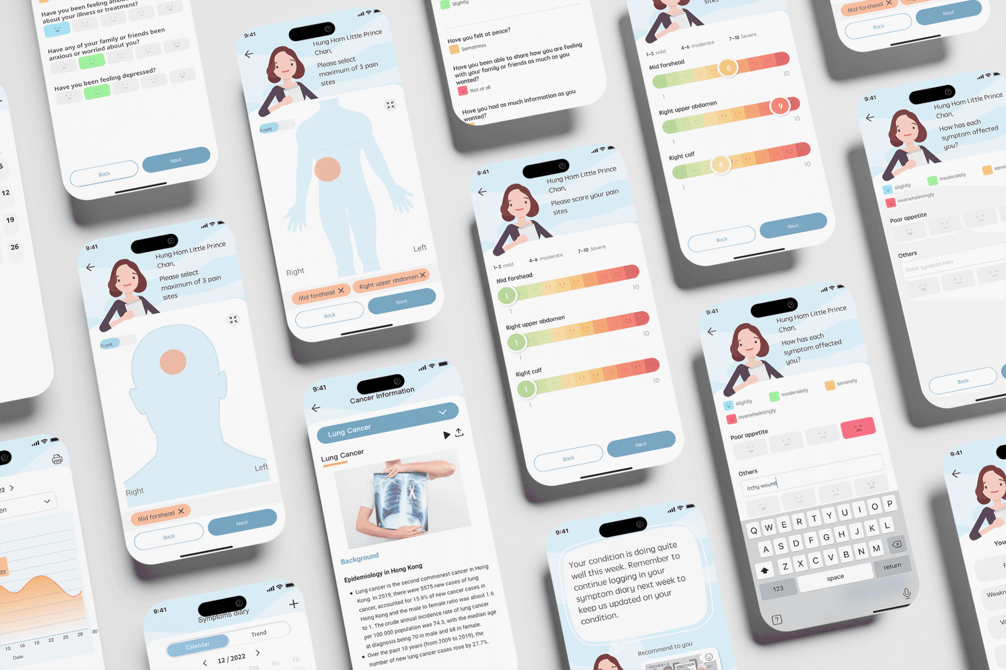
Design Symptoms diary for patient
While my primary focus was on website design, I also contributed to the mobile app design by collaborating with a partner designer to establish the initial look and feel, eventually taking over her responsibilities. The doctor greatly appreciated the "Auntie Care" character concept, prompting us to feature this female character consistently throughout the entire project, which was even showcased in a public exhibition.
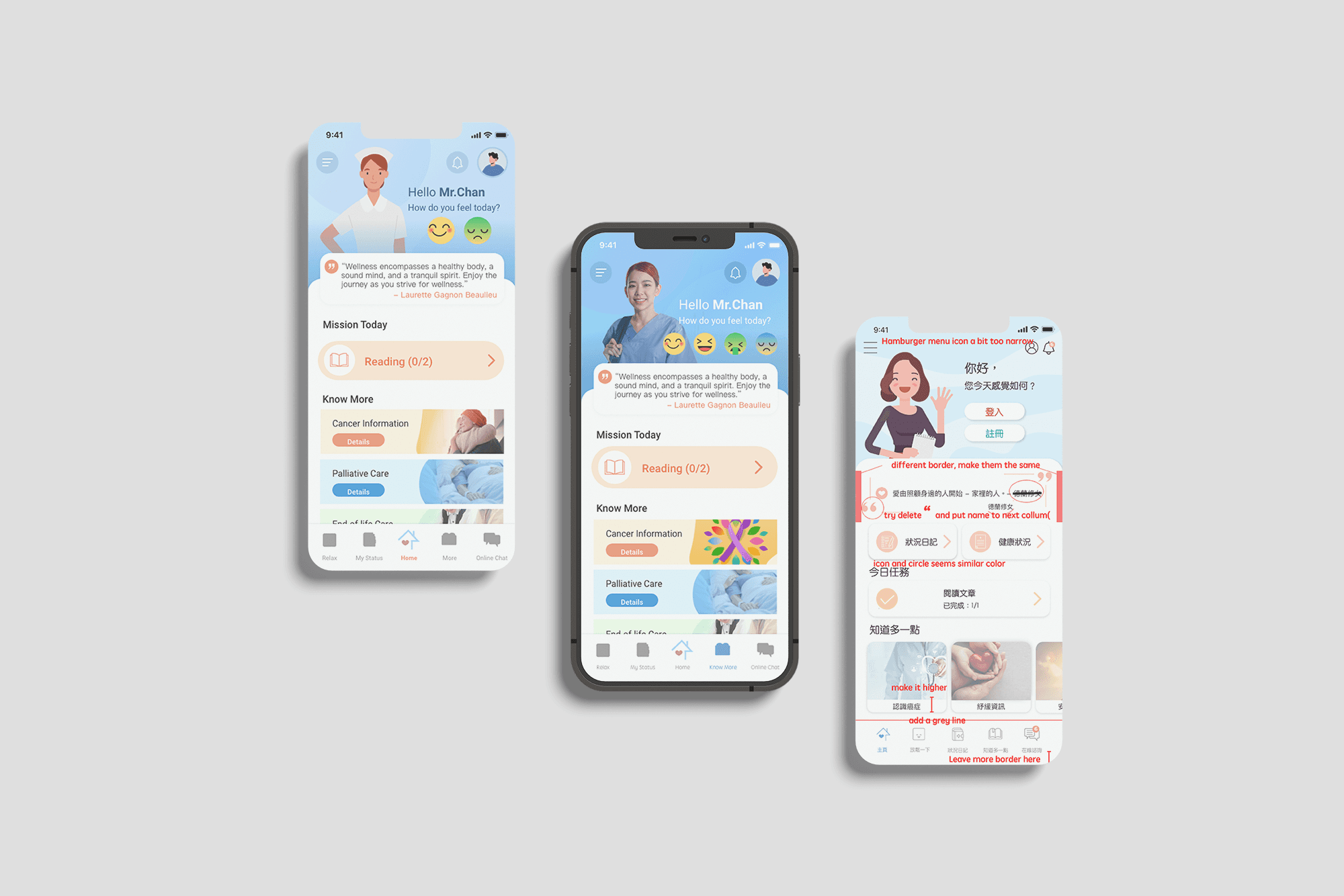
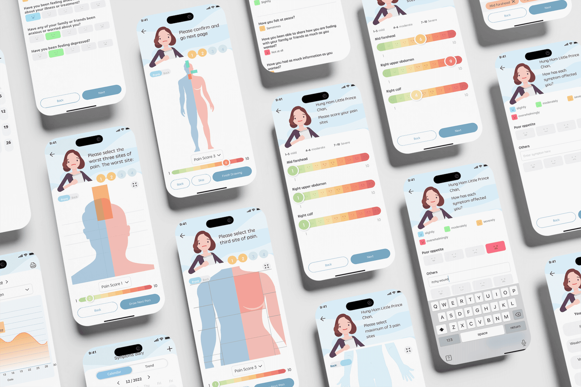
To closely monitor patients' symptoms, we integrated a symptom diary into the mobile app, allowing patients to record their daily pain levels as needed. This feature ensures that nurses can access up-to-date health statuses and track patient progress at any time.
The doctor requested a user-friendly design that allows patients to easily rate their pain levels. To achieve this, I dedicated time to research and establish a design direction tailored to the clicking habits of elderly users—minimizing the number of required clicks and reducing heavy text reading.
After several iterations of the body charts, a final unisex version was successfully confirmed.
Final Designs
Image-oriented designs
Human-Centered Real Photography
Prioritizing real, empathetic photographs of people and families over cold vector illustrations to create a warmer, more relatable, and reassuring emotional tone for elderly users.
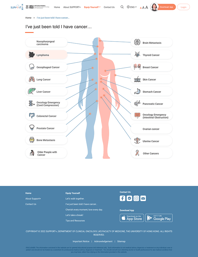
Visual Body-Mapping Navigation
Utilizing clear anatomical body diagrams on the cancer information pages to help users intuitively locate and click on specific cancer types or health topics visually.
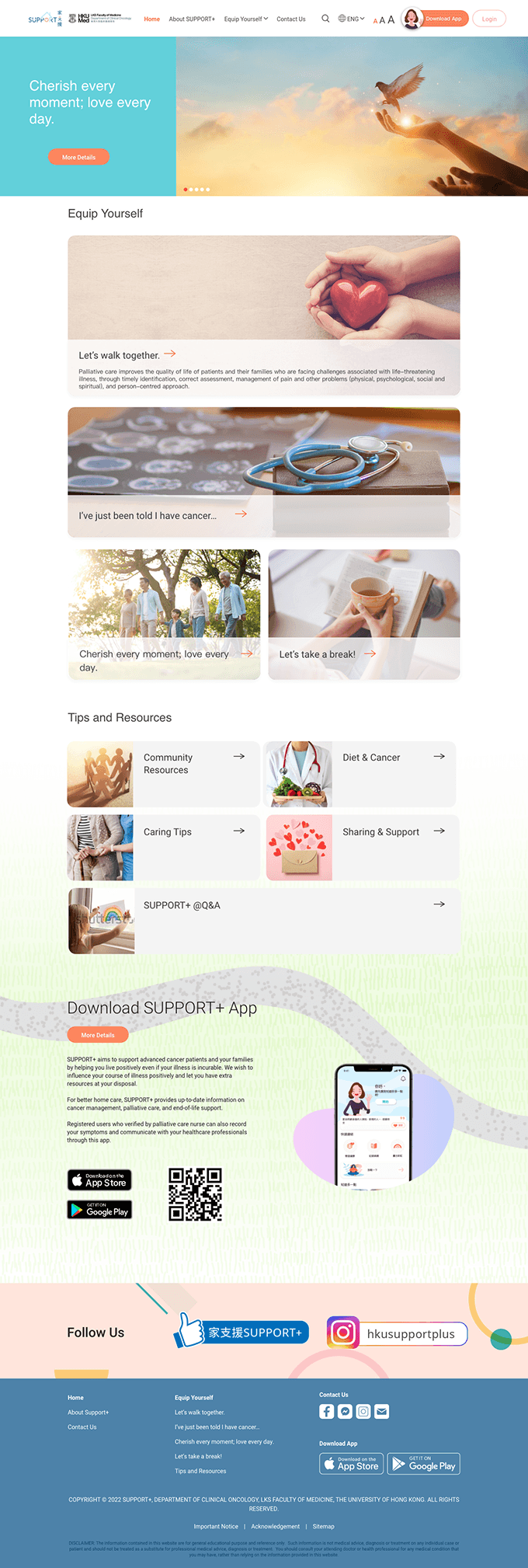
Visual Card-Based Layouts
Structuring sections like "Tips and Resources" into clean, icon-supported image cards to make navigation visually distinct and cognitively manageable for users under stress.
Explore more
No items