HK Govt
2024-2026
Revamp a government system
I helped HK Govt to revamp an internal system into a more modern one.

Overview
Revamp system to a brand-new one.
The department internal portal revamp modernized the organization's intranet and introduced an intuitive front-end application for holiday homes and welfare services. By improving visual hierarchy and streamlining workflows, the redesign reduced administrative friction and enhanced the everyday digital experience for internal personnel.
Our Goal
Bring a brand new system for user in future 10 years.
Problem
Messy layout and difficult navigation
On this landing page, the main problem is the heavy clutter and messy layout. The page forces users to look at a crowded menu bar full of text at the top, right next to a giant block of icons below. Because everything looks equally important, it is hard to find what you need quickly. In the end, the confusing design and lack of clear structure make everyday tasks slow and frustrating.

Old landing page
Study
Looking beyond the old components
What we prepared

Pre-design progress
Ideation
Exploring interface directions
Before starting the redesign, I audited all the old system components to make sure everything would sync smoothly with the new look. I looked closely at how the legacy interface was built, tracked how users moved through the crowded menus, and found where people usually got stuck during their daily usage.
Find out all old components
Moreover, we, 3 designers shared 3 sets of different designs for voting, using existing system hierarchy. Client would love to have a fresh and bright landing design.

Designer customize style

e_HR system & front end mobile app
Confirm the IA
We confirm IA at the beginning stage so user can figure out the progress. As the system contains tons of screens, we need to seek counter confirmation on the layers we need to put in the map.

Confirmed IA structure: Module + first layer
Invite modules owners to vote
I presented the new design concepts through detailed descriptions and visual walkthroughs. During the session, product owners actively participated by reviewing the options and voting for their ideal designs directly using iPads.
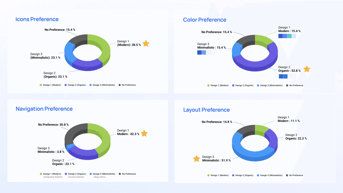
Live voting result from owners
Designs
Refining the dashboard experience
Challenges & Constraints
👩👩👧👧 Managing diverse user roles and digital literacy | 🈵 Handling massive scale and system complexity |
|---|---|
The platform serves personnel of varying ranks and technical skills, requiring a unified interface that balances high-level metrics for senior officers with intuitive routine workflows for everyday staff. | Growing organically over 15 years, the legacy system accumulated thousands of fragmented pages and nested forms. The challenge was auditing and consolidating this massive scale into a streamlined architecture without disrupting critical workflows or losing core functionality. |
What are our features in new generation of system?
Breathing Room for Dense Workflows
Optimized whitespace to counterbalance heavy data entry and documentation, creating a calmer, more breathable interface that reduces user fatigue.

New age landing page
Personalized Dashboard Layouts
Recognizing that different roles require different workflows, the system introduces 4 selectable layout orders, allowing personnel to customize their screen structure for a smoother daily experience.

4 types of layout
Collapsible & Clean Form Design
Keeping the interface tidy, clean, and easy to use, we set rules and create full design system, also specification document shared to development team.

Rule setting to form fillings

Design spec
Lessons
Balancing Information Density and Simplicity
This project completely shakes off that typical, boring government stereotype.
Embrace Collaborative Decision-Making Early
Involving product owners directly in design reviews using interactive sessions (such as iPad voting) bridged the gap between stakeholders and designers, ensuring faster alignment and stronger buy-in for the final direction.
Design Systems Must Scale with Complexity
Managing thousands of legacy screens taught us that a clean interface requires rigid, scalable foundational rules—such as adaptive form columns and responsive layouts—to handle high data density without overwhelming users.
Simplification Requires Strategic Trade-offs
Revamping a 15-year-old system is not just about a visual facelift; it requires tough choices on what to cut, what to consolidate, and how to restructure cluttered entry points to truly give users a "breathable" and efficient experience.
